Define the decision and metrics before choosing a chart
A good dashboard does not start with a visualization. We establish the audience, decisions, and metrics, then check whether the source data supports the agreed calculation method. We design the data layer and report so users understand the result, can drill down into details, and know when the information was refreshed.
We deliver both individual reports and broader reporting environments. We work with Power BI, Tableau, Amazon QuickSight, and Looker, among other platforms. We connect data from ERP and CRM systems, data warehouses, files, and APIs. Before acceptance, we compare key metrics with the agreed sources. After launch, we develop the solution and establish how it will be maintained.
The first stage
- We select the business question and the person accountable for the result.
- We agree on metric definitions, sources, and the refresh frequency.
- We prepare a proposed view and review it with the audience.
- We build the data layer and report, then test the result.
- We establish publication, permissions, documentation, and further development.
If reports show conflicting results or the environment is slow and costly, start with a BI Optimization Assessment. If manually combining sources is the problem, see DataFlow. Explore the full Data & BI offering.

Reports and dashboards tailored to the business
We create clear, automated reports and dashboards for companies that need to make faster, better decisions based on reliable data refreshed when required. We replace manual reporting in Excel and other less efficient tools with fast access to key metrics, refreshed on a schedule or available in real time.
With more than a decade of experience in Business Intelligence and data projects across industries, we build solutions tailored to the organization and each user’s role. We develop the reporting layer in line with UX/UI best practices, making it intuitive to use and visually clear while automating key reporting processes.
Our approach enables clients to:
- Make better decisions faster using reliable data.
- Reduce the risk of errors and the costs of manual reporting.
- Increase the efficiency of analytics and operations teams.
- Improve process transparency and communication across the organization.
We deliver solutions that do more than present data—they create tangible business value.
Reports and dashboards we create
Sales and distribution report
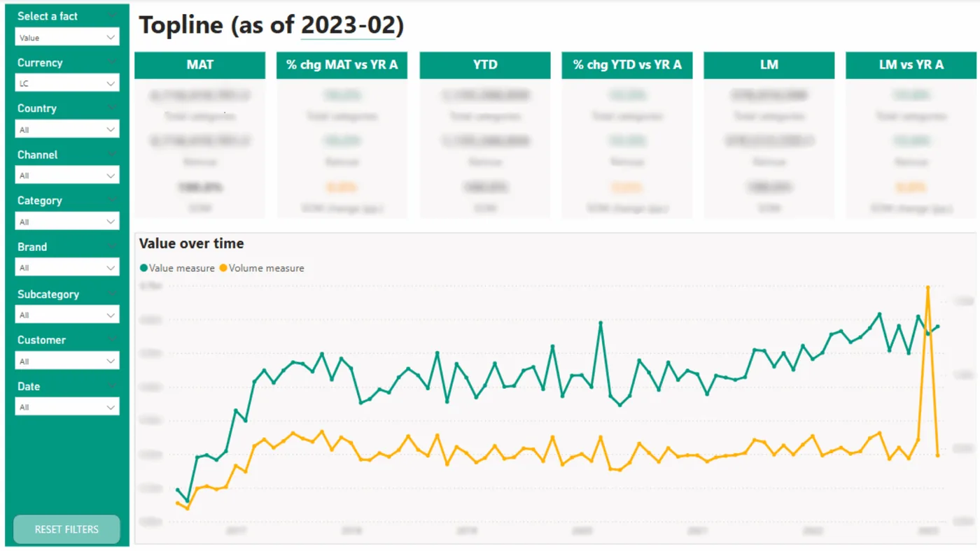
Monitor key sales and distribution metrics—from sell-out, market share, and margin to product availability, inventory turnover, and sales forecasts. Our reports support sales channel management, analysis of sales to key clients, assessment of price promotion performance, and sales team KPIs. Clear dashboards enable teams to respond faster and sell more effectively.
Financial report
Monitor finances in real time. We provide dashboards covering revenue, including monthly recurring revenue (MRR); costs, including labor costs; margins; cash flow; the balance sheet; profit and loss; the budget and budget variances; and the operating expense structure. Our solutions support management reporting, profitability analysis, and forecasting, giving executive teams full visibility into performance. Geolocation also enables profitability analysis by branch, region, and country to support better strategic decisions.
Marketing report
Measure performance in a specific region or across the organization. We visualize promotion performance and analyze the share of promotional sales, the impact of trade marketing, and return on investment (ROI). Our dashboards assess the performance of channels, products, and marketing messages in one place.
Manufacturing report
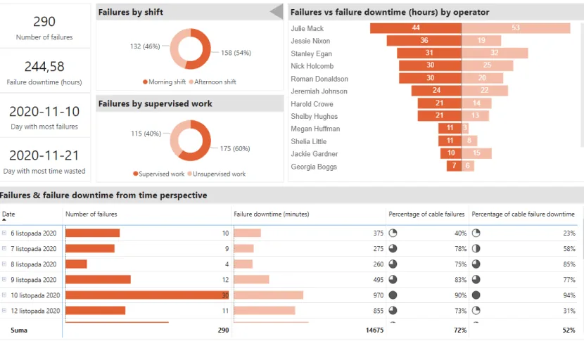
Gain full control over the manufacturing process. Monitor line performance, downtime, plan completion, OEE, resource efficiency, quality, production waste, production flow between stages, and compliance with FIFO release rules, and respond to critical project paths. We create clear dashboards for planning, maintenance, and operational management. They support data-driven decisions every day.
Survey report
Turn feedback into data. We create reports presenting employee satisfaction surveys, internal surveys, and feedback from clients and partners. Dynamic filters, comparisons over time, and clear visualizations make them useful for HR, customer experience, and executive teams.
Scenarios and decision analysis
We make decisions easier with dashboards that compare budget variants, investment scenarios, and optimization scenarios. We do not create the underlying subject-matter models; we visualize them so they are understandable, interactive, and useful in real decisions. These dashboards are designed for finance departments and executive teams.
Pharmaceutical and consumer health market report
Market share, sell-out, sales representative and sales team performance, new product launch monitoring, and omnichannel sales in one data model. The dashboards combine market data with the company's sales data and show where a product gains or loses ground.
HR report
Absences, overtime, labor costs, and their structure by department, location, and period. The report supports workforce planning, labor cost control, and faster identification of overloaded teams.
Logistics report
Shipment flow and sorting, on-time delivery, complaints, and transportation costs. The dashboards show bottlenecks in the logistics network and enable comparisons between branches, routes, and carriers.
Why choose Astrafox?
- Extensive experience and expert knowledge
For years, we have built solutions that enable companies across industries to use data for business growth. Our teams specialize in advanced analytics reports and dashboards that address real user needs at every level of the organization.
- Leading technologies
We work with leading Business Intelligence platforms, including Power BI, Tableau, Amazon QuickSight, and Looker. We combine them with advanced data integration technologies, ensuring consistency, performance, and information security.
- Dashboards tailored to the organization
We build solutions precisely aligned with our clients’ business goals. From simple executive dashboards to comprehensive analytics systems, every dashboard is designed for intuitive use, clarity, and tangible value for the user.
- Visualization and analytics best practices
We apply established data visualization standards, including IBCS, information minimalism, and data storytelling. We design report layouts and navigation, standardize the appearance of reports across the environment, create mobile views, and embed reports in company applications and portals. As a result, our reports look professional and, above all, support better decisions.
- Broad industry experience
We have completed hundreds of projects for companies in pharmaceuticals and consumer health, manufacturing, logistics, FMCG, cosmetics, finance, telecommunications, cybersecurity, real estate, and consulting. We understand different types of data—from operational and sales data to financial and marketing data—and turn them into a tangible competitive advantage.
- Transparency and partnership
Clients have full visibility into the solution development process. We review progress regularly, discuss the options, and recommend the best course of action. We value openness, honesty, and full transparency.
- Flexibility and alignment with the client
Every company has different needs and budgets. We therefore propose solutions tailored to the specific situation in both functionality and project scale. Our goal is to deliver maximum value while using the client’s resources efficiently. Each client also works with a dedicated consultant who understands the business and the context behind the analyzed data.
Technologies used for reports and dashboards
Technologies we use to create reports and dashboards
We work with established Business Intelligence tools. We have years of experience building modern analytics environments with widely recognized and actively developed BI platforms. We always match the technology to the client’s infrastructure, operating scale, and end-user expectations.
Most projects use Power BI and Tableau, both established data analytics platforms. We also support clients using Amazon QuickSight and Looker, particularly in cloud-native environments and complex organizations.
Power BI—business analytics platform
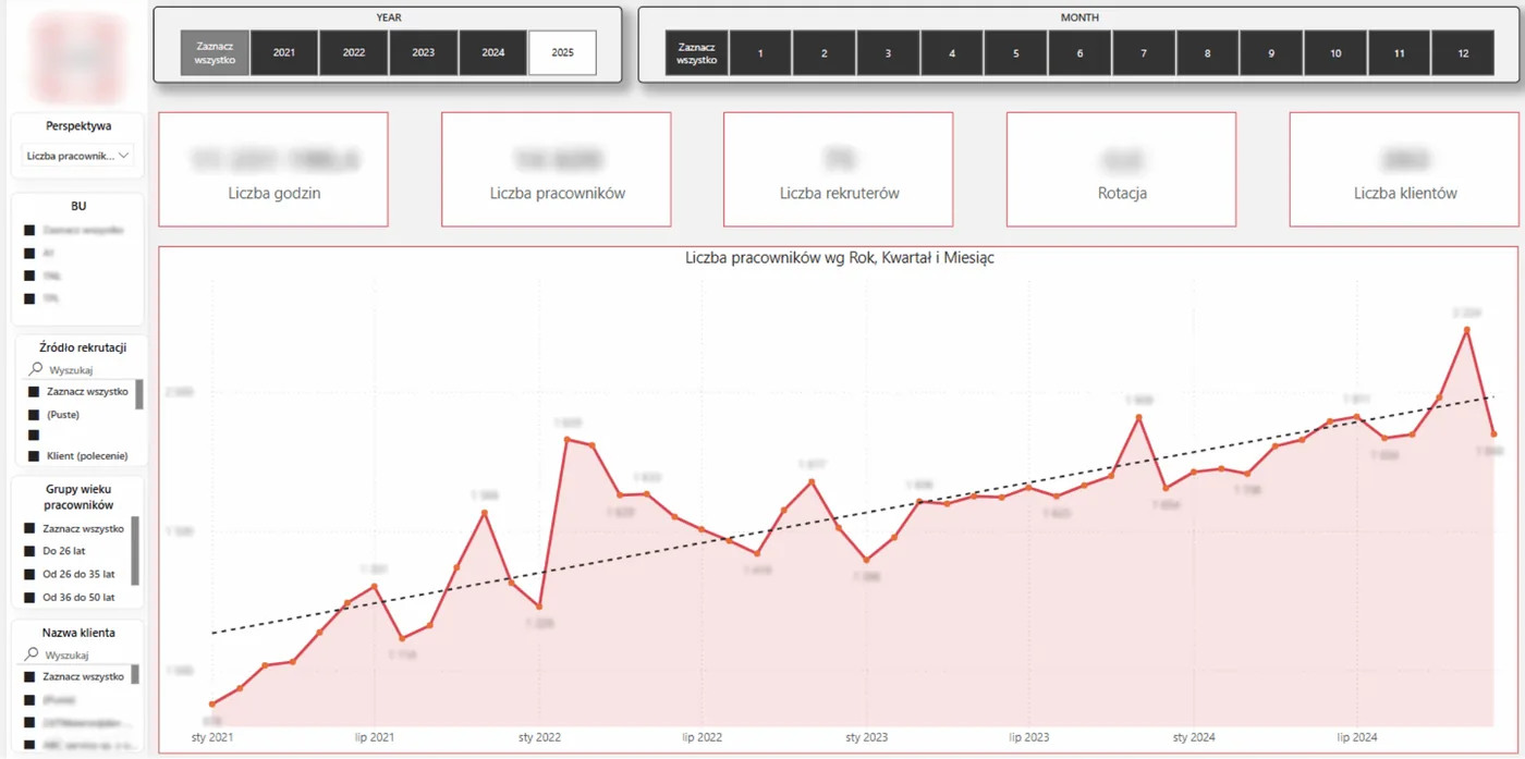
Microsoft Power BI is one of the world’s most popular Business Intelligence tools.
Why Power BI?
- Fast integration with diverse data sources, including ERP, Excel, SQL, and APIs.
- Automated data refresh and report sharing.
- Clear, interactive dashboards for every user level.
- Full integration with the Microsoft ecosystem, including Azure, SharePoint, and Teams.
- Strong value for the price.
- Server and Cloud versions for secure report sharing.
Key capabilities:
- Dynamic filtering and drill-down data exploration.
- DAX for advanced calculations.
- Custom data model development.
- Mobile and web versions of reports.
Tableau—a global standard for data visualization
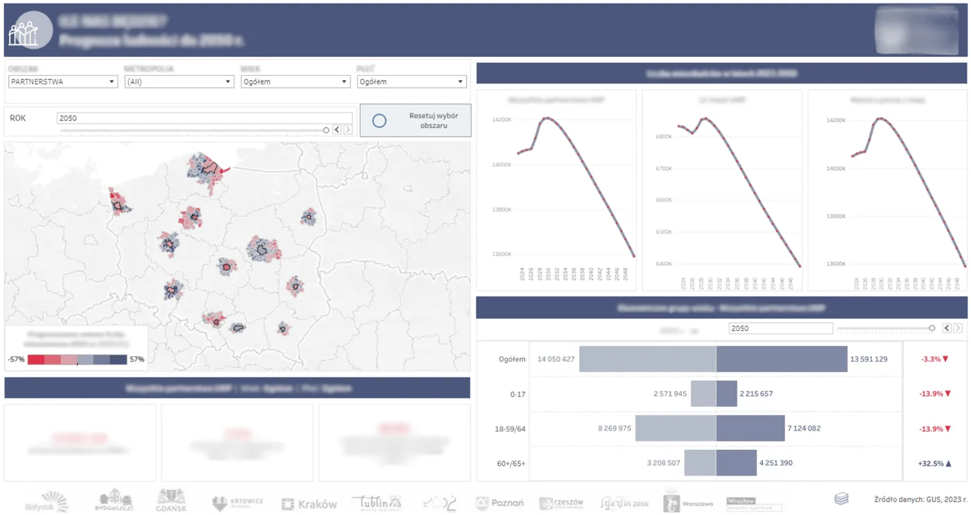
Tableau is an analytics platform valued for powerful visualization, flexibility, and intuitive use. It is designed for companies that need to understand data faster and more deeply.
Why Tableau?
- Advanced visualization capabilities.
- Intuitive drag-and-drop interface.
- Integration with data warehouses, cloud platforms, and APIs, including Snowflake and BigQuery.
- Support for maps and geospatial data.
- Server and Cloud versions for secure report sharing.
Key capabilities:
- Interactive dashboards and data storytelling.
- Embedding reports in applications and portals.
- Support for complex calculations and analyses.
Amazon QuickSight—flexible analytics in AWS
- Full integration with Amazon Web Services, including S3, Athena, and Redshift.
- A pay-per-session model that is cost-effective with large audiences.
- Built-in machine learning predictions and alerts.
- Dashboard sharing without installing software.
Looker (Google Cloud)—BI based on a centralized data model
- Data modeling in LookML, providing one set of business logic for the entire company.
- Data exploration by end users through self-service BI.
- Tight integration with BigQuery and data warehouses.
- Scalable reporting for environments with large data audiences.
We match the tool to the organization. Together with the client, we select the tool that best addresses organizational needs such as user numbers and data types, technology needs such as on-premises or cloud infrastructure, and budget. We do not sell tools—we deliver working, well-designed analytics solutions that make daily work with data easier.
We most often choose Power BI and Tableau because they provide clients with a strong balance of capabilities and cost and a high degree of flexibility in adapting to processes and business requirements. These solutions scale from small teams to large organizations. Their vendors also develop and update them regularly and continually add new capabilities.
Example of an operations and IT report
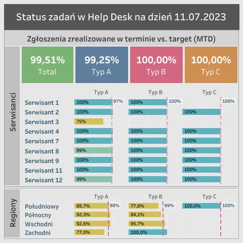
Examples of report and dashboard implementations
Examples of reports and dashboards that changed how teams work with data
Sell-out sales report for an FMCG manufacturer
Business challenge
An FMCG manufacturer needed current, clear data on product sales in retail chains. Its analyses were fragmented, time-consuming, and based mainly on Excel reports, making fast marketing and sales decisions difficult.
Our solution
We created an integrated Power BI dashboard that combines sell-out data from different distribution sources. The dashboard provides:
- Data standardization across regions.
- Automated data preparation.
- Sales analysis by product, category, store, and period.
- Dynamic filtering and drill-down into detailed levels.
- Automated data refresh on a defined schedule.
The visualizations follow best practices and provide fast insight into results.
Client benefits
- Current information about sales performance in retail chains.
- Faster marketing and sales decisions.
- An automated, integrated analytics platform instead of manual work in Excel.
- Easy sharing of results with sales and marketing departments.
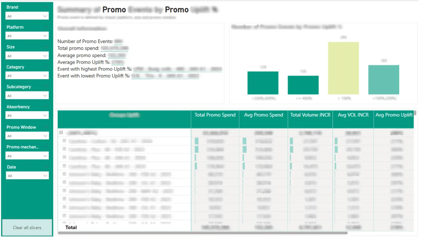
Price promotion analysis report for a retail supplier
Business challenge
A supplier to a large retail chain needed a tool to analyze the performance of price promotions, including their impact on sales volume, inventory turnover, and margin. There was no single place where teams could quickly assess promotional activity.
Our solution
We designed a comprehensive Power BI report that analyzes:
- The share of promoted products in total sales.
- Margin changes during a promotion.
- Inventory turnover before, during, and after a promotion.
- The report enables users to compare campaigns quickly and draw conclusions for future activities.
Client benefits
- Precise assessment of price promotion performance.
- Optimization of promotional plans and marketing budgets.
- Better promotion calendar planning based on profitability.
- More effective sales and marketing activities.
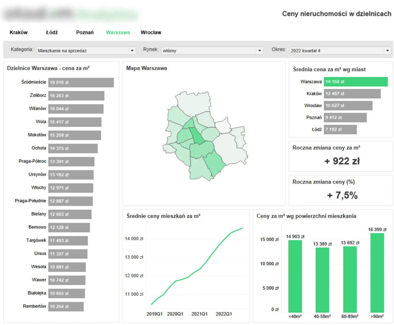
Housing price analysis dashboard for the real estate industry
Business challenge
A real estate company needed an analytics tool for ongoing monitoring of housing price changes in Poland’s largest cities. Its analyses were manual and static, preventing a fast response to changing trends.
Our solution
We created an interactive Tableau dashboard that integrates public and commercial real estate market data. The dashboard provides:
- Housing price analysis by location, floor area, and finish standard.
- Price change comparisons over time.
- Filtering by selected criteria such as the number of rooms and year of construction.
The complete solution is intuitive and visually appealing.
Client benefits
- Current, dynamic real estate market data.
- Fast analysis of price trends across cities and market segments.
- Support for investment and marketing decisions.
- Time savings for analysts and executive teams through automated analysis.
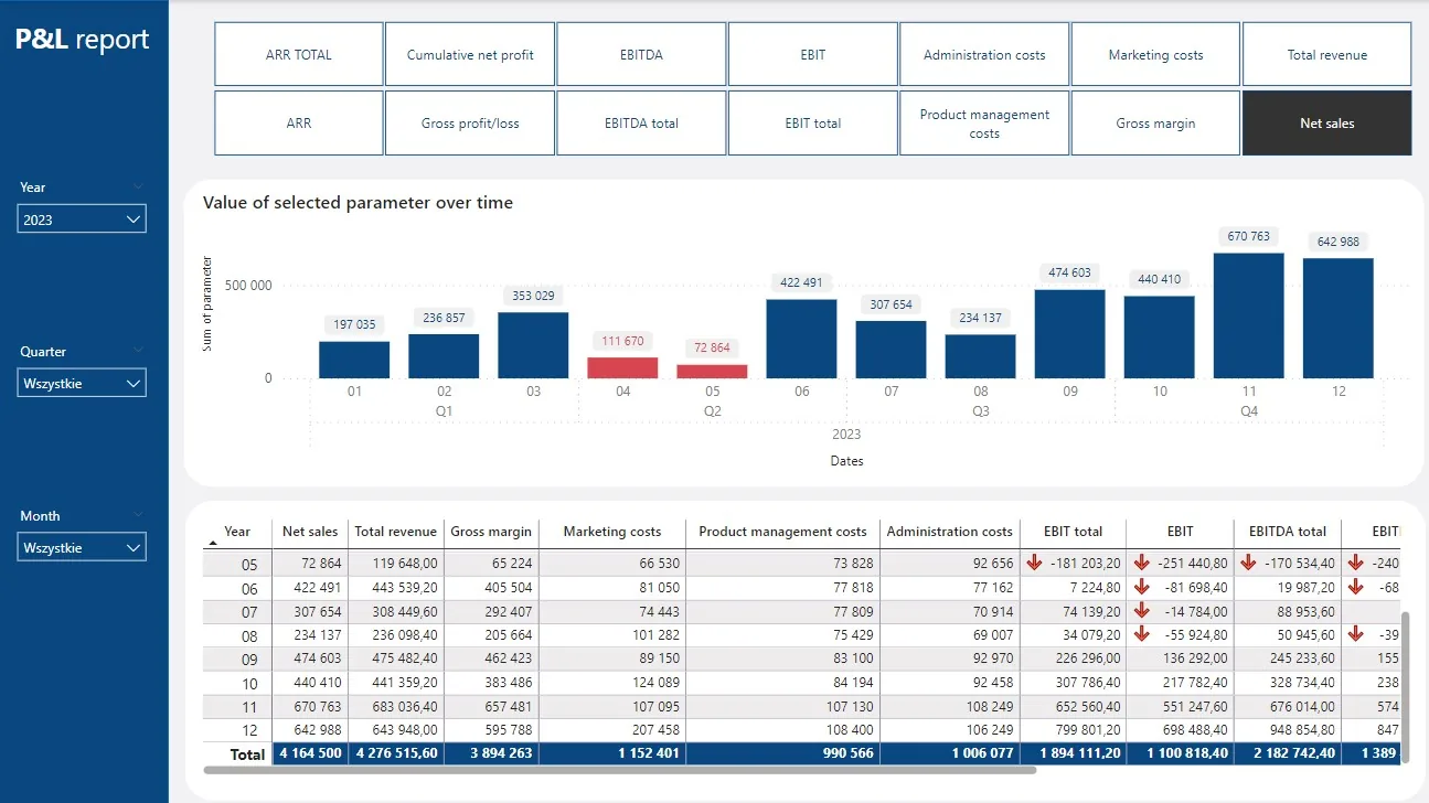
Financial dashboard—monitoring costs, revenue, and profitability
Business challenge
A service company needed a clear, current view of its financial condition at both the organization level and the individual business unit level. Financial reporting relied on manual Excel reports, increasing preparation time and limiting how current the analyses were.
Our solution
We designed a comprehensive Power BI financial dashboard that automatically combines data from the accounting and ERP systems. The dashboard provides:
- Ongoing monitoring of revenue, costs, margin, and cash flow.
- Monthly and annual budget variance analysis.
- Profitability analysis by product, client, and department.
- Dynamic filtering and custom views for business users.
The report is available on desktop and mobile devices, giving executive and financial control teams fast access to key data.
Client benefits
- Current insight into financial performance without time-consuming manual reports.
- Early detection of budget overruns and cost inefficiencies.
- Better budgeting and financial forecasting.
- Greater transparency and stronger support for management decisions.
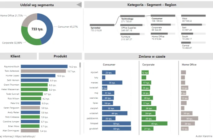
Business scenario visualization—interactive decision dashboard
Business challenge
A service company needed a tool to compare different business growth scenarios quickly and clearly, including budget variants, investment plans, and cost optimization scenarios. Its analyses were prepared in Excel and presented as static tables, making them difficult to interpret and use in decisions.
Our solution
Using the client’s data and subject-matter assumptions, we created modern, interactive dashboards in Power BI and Tableau. Our work included:
- Data preparation and transformation (ETL)—automatically converting input files into a structure suited to scenario analysis.
- Dashboard design—building clear, intuitive visualizations that compare different variants.
- Dynamic functionality—selecting scenarios, comparing results, and filtering data by selected parameters.
Our role was to make the visualization layer as clear and useful as possible without changing the substance of the scenarios prepared by the client.
Benefits:
- A modern tool for visually comparing scenarios and variants.
- Faster decisions through interactive analysis.
- Automated data preparation and fewer manual errors.
- Stronger support for executive, financial control, and planning teams.
- A choice of Power BI or Tableau based on the client’s preference.
Engagement models and frequently asked questions
Need a report or dashboard?
Are analyses still based mainly on Excel files? Are ERP reports inflexible, outdated, or difficult to use? We will show how a modern reporting environment changes the way data is managed and decisions are made. We create dashboards and reporting environments that are fast, clear, and precisely tailored to the business.
How do we work?
We adapt the engagement model to the client’s needs:
- Project-based—comprehensive report implementations from start to finish.
- Package-based—fast solutions with a fixed scope, delivered within the client’s package of hours.
- Outsourced—ongoing support for the analytics and reporting team.
Why is it worthwhile?
- Automated work with data without manually merging files.
- Dynamic analyses available on desktop and mobile devices.
- Fast data updates and complete visibility into results.
- Solutions aligned with the organization’s pace of growth and budget.
Let us discuss the data. Schedule a free consultation—we will assess the situation and show how to advance the reporting environment. Contact us to see data analysis without limitations.
1. Is it worth replacing Excel with Tableau or Power BI?
Excel works well for simple analyses, but it becomes inefficient with larger data volumes, automation needs, and teamwork. Power BI and Tableau provide dynamic visualizations, automatic data refreshes, and interactive dashboards available online.
2. What are the benefits of implementing business dashboards?
Professional dashboards provide fast insight into key performance indicators (KPIs), automate analyses, eliminate manual reporting errors, and significantly speed up decisions.
3. What is the difference between Power BI and Tableau?
Power BI integrates tightly with the Microsoft ecosystem and is well suited to fast BI implementations. Tableau provides greater flexibility in visualization and geospatial data analysis. Both platforms are widely used in BI solutions.
4. Do you create reports tailored to each client’s needs?
Yes. We design every reporting environment individually, aligning the data layout, KPIs, and presentation method with the client’s business processes and goals. We propose the visual layer before implementation begins to minimize the cost of later adjustments.
5. What does a dashboard or report implementation involve?
We start by analyzing needs and data. We then design an initial visual version of the report, gather feedback, implement the complete solution, and test it. We provide documentation with the solution. Depending on the client’s requirements, we work on a project, package, or outsourcing basis.
6. Which systems do you integrate with reports?
We integrate Power BI and Tableau with ERP systems such as SAP, Microsoft Dynamics, and IFS; CRM systems; data warehouses such as Snowflake and BigQuery; Excel files; SQL databases; APIs; and many other data sources.
7. Do you migrate reports from Excel to Power BI or Tableau?
Yes. We specialize in moving reports from Excel to modern analytics environments while preserving functionality and significantly improving performance, automation, and usability. We also migrate reports and complete environments between technologies.
8. Which industries have you worked with?
We have completed BI projects for companies in pharmaceuticals and consumer health, manufacturing, logistics, FMCG, cosmetics, finance, telecommunications, cybersecurity, real estate, and consulting. We understand different types of data, from sales data to operational and financial data.
9. How long does a dashboard or reporting environment implementation take?
The timeline depends on the project’s scale and data complexity. We deliver the first dashboards within a few weeks. Complete reporting environments for midsize companies usually take three to six months to implement.
10. How much does a Power BI or Tableau implementation cost?
The cost depends on the project scope, number of reports and users, license types, data sources, and engagement model—project, package, or outsourcing. We always propose several options aligned with the client’s needs and budget and provide fully transparent pricing.