Data from multiple places in one view of the company
Financial, sales, and operational metrics from different systems in one report, with consistent definitions. We do not replace existing BI; we add a layer of strategic metrics and interpretation.
AI Business Indicators is our product that combines data from multiple systems in one strategic metrics report and explains what the results mean. We know which metrics truly reflect business health, so the project does not start with an empty dashboard. Based on the results, AI prepares insights and recommendations for management and departments. Each metric expands to show its calculation method and source records. We adapt the product to the client's business and source systems; it does not require a BI engine.
Management boards, supervisory boards, and management teams need a consistent view of the situation, regardless of how many systems and reports contain the data. This applies both to companies working with spreadsheets and to those that already have advanced BI analytics.
| Before | After |
|---|---|
| Metrics scattered across spreadsheets, systems, and BI reports | One strategic metrics report that combines data from multiple sources, with consistent definitions and an explanation of how each metric is calculated. |
| A PowerPoint presentation assembled manually before every meeting | An up-to-date view available at any time, with color-coded status against the target. |
| No way to see which records produced the result | Clicking a month on the chart opens the list of source records behind it. |
| Numbers and reports without interpretation, leaving management to analyze them alone | AI insights and recommendations explain what the numbers mean and identify areas for action. This also adds value for companies that already have advanced BI analytics. |
| Similarly named metrics have different definitions | Metrics calculated in different ways have clearly distinct labels. |
The demo is a fully interactive web application based on a B2B SaaS company. Switch between metrics, expand the methodology, click months on charts, open source records, read AI insights, and change between light and dark mode. All data, client names, and business scenarios in the demo are fictional and used solely to present the tool's capabilities.
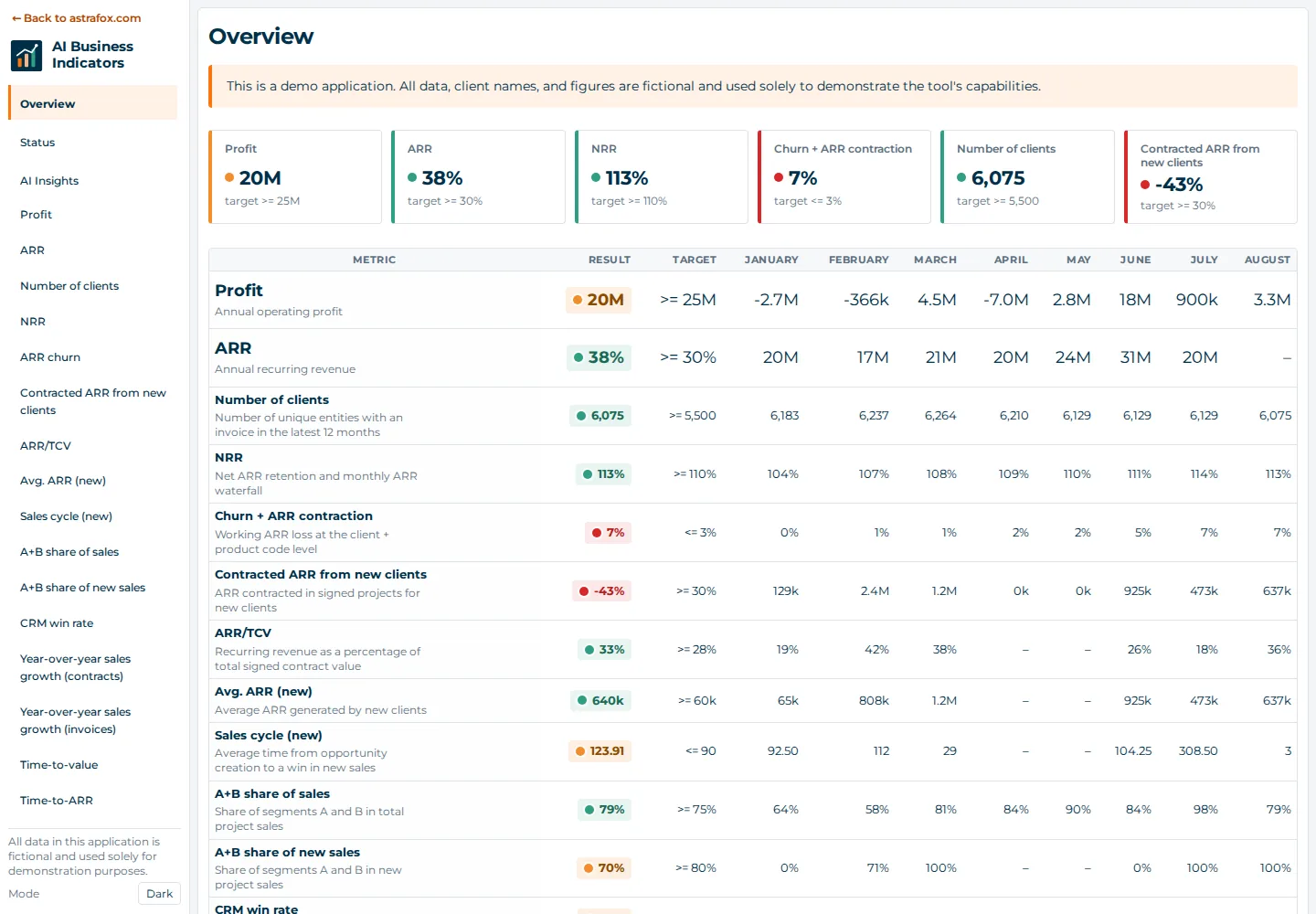
Nine benefits for companies working with spreadsheets and for those that already have advanced BI analytics.
Financial, sales, and operational metrics from different systems in one report, with consistent definitions. We do not replace existing BI; we add a layer of strategic metrics and interpretation.
The user receives metrics and charts together with AI data analysis: an assessment, strengths, risks, and recommendations for departments in business language.
The application includes business knowledge about strategic metrics that matter to company growth: their definitions, calculation methods, and interpretation. The project starts with a proven set of measures adapted to the business, not an empty dashboard.
We use AI to adapt the application quickly to the company: its metrics, definitions, targets, and way of describing results.
The application does not require BI engines such as Power BI, Tableau, or Qlik. It is a standalone browser-based tool that complements an existing BI environment or works without one.
The application retrieves data from any source: databases, data warehouses and data platforms such as Snowflake and BigQuery, as well as directly through APIs from business systems such as CRM and ERP.
Move from a chart to the source records behind the result. The question “Where did this number come from?” ends with one click.
Annual results as weighted sums, breakdowns that add up to 100%, distinct labels for distinct definitions, and calculation methods visible in the interface.
Color-coded status against targets, a Status screen showing “what is going well / what is going wrong,” and plain-language explanations of terms that are also clear to people without a finance background.
The home screen presents key metrics with color-coded status against targets. Each metric leads to details: a chart, methodology, and source records.
ARR (annual recurring revenue) split between new and existing clients, contracted ARR from new clients before invoicing, recurring revenue as a share of total contract value (ARR/TCV), and year-over-year sales growth calculated from contracts and invoices.
Monthly and cumulative operating profit and a revenue → cost → profit bridge in a waterfall chart. Margin is calculated as total profit divided by total revenue for the period, not as an average of monthly margins.
NRR (net revenue retention) with a monthly ARR bridge: new and reactivated clients, expansion, contraction, and churn. Churn is broken down by cause, including an indication of which causes remain within the company's control.
CRM win rate, time from opportunity creation to close, and the share of A/B/C segments in total sales and sales to new clients. The breakdown always adds up to 100%, including clients with no assigned segment.
The number of days from contract signature until the client begins using the service and generating recurring revenue. The metric uses the 90th percentile so that individual outliers do not distort it.
The Summary screen shows all metrics with targets and monthly results. The Status screen uses two columns to show “what is going well” and “what is going wrong” for someone with only a few seconds before a meeting.
This is more than a dashboard with numbers and charts. Purpose-built application screens contain an AI-prepared interpretation of the results. They explain what the metrics mean instead of leaving interpretation to management. The analysis considers values, targets, and monthly changes across all metrics.
A full-year summary of the company's condition.
A list of the main strengths and risks indicated by the data.
Proposals for product development, marketing, sales, implementation, and support based directly on the numbers.
An explanation of the most recent change and whether it appears to be a lasting trend.
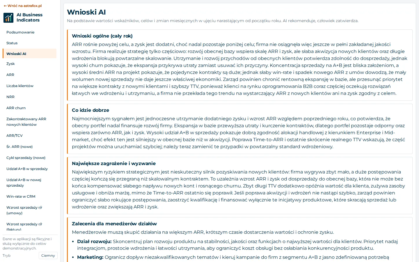
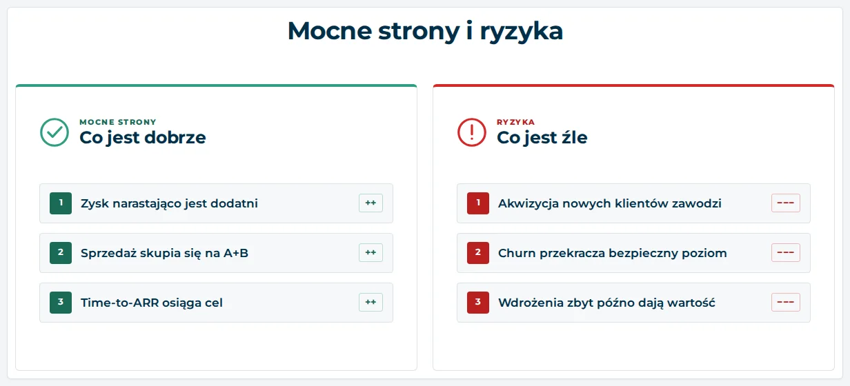
AI insights are a proposed analysis for review, not a decision. Management and analysts verify them against the data, available in the application down to source-record level. In the demo, the insights were prepared in advance using sample data. In a company deployment, we refresh them according to the schedule defined during implementation.
Methodology is what separates an attractive dashboard from a trustworthy one. We followed five principles in this application.
| Principle | What it means in practice |
|---|---|
| Annual result as a weighted sum | We calculate percentage metrics as the sum of the numerator divided by the sum of the denominator—for example, total ARR divided by total TCV—not as an average of monthly values, which gives a misleading result when volumes differ. |
| Breakdowns add up to 100% | Every category or segment breakdown totals 100%, and a “missing data” category is shown explicitly instead of being silently omitted. |
| Different definitions, different labels | Metrics with similar names but different calculation methods—for example, pure churn and churn including ARR contraction—have clearly distinct names to avoid suggesting consistency when different measures are being compared. |
| Methodology visible in the application | The calculation method for every metric is available in the interface, with abbreviations expanded and Polish equivalents of industry terms, making the dashboard clear even to a board member without a finance background. |
| Drill down to the source | No number is a black box: clicking a month on a chart opens the source records behind the result. |
The demo presents the model of a B2B SaaS subscription company where tracking ARR, retention, churn, and sales performance is part of everyday work. We apply the same approach to metrics in other companies.
A shared view of ARR, retention, churn, and sales, with the ability to verify the source of every result.
An always-available view of the company's condition instead of a presentation prepared manually before every meeting.
A quick indication of where the sales pipeline and implementation process slow down.
The demo shows the product using sample data. For a company, we adapt it to the business and source systems: we configure the metric set, definitions, targets, and presentation of insights, and connect data from any source—databases, data warehouses, data platforms such as Snowflake and BigQuery, and business systems through APIs, including CRM, ERP, and accounting systems. The result is an interactive tool in which numbers are calculated correctly and build a trustworthy picture of the company without having to ask an analyst for clarification.
Management questions, metrics, and current calculation methods.
Connections to databases, warehouses, data platforms, and systems through APIs.
Agreement on the methodology and targets for every metric.
Metrics, charts, drill-down to records, and AI insights.
Comparison of results with existing reports.
After reviewing your metrics and data sources, we prepare the scope, schedule, and launch option. We combine data scattered across spreadsheets, systems, and reports, including at companies that already have BI in place. DataFlow prepares data from the sources.
It is an interactive analytics application that shows a company's financial and sales metrics, explains how each metric is calculated, provides drill-down to source records, and includes AI insights: an assessment, strengths, risks, and recommendations for departments.
No. All figures, client names, and business scenarios in the demo are fictional and used solely to present the tool's capabilities.
No. The demo presents metrics for a subscription company because they clearly illustrate work with ARR, retention, and sales. The product uses the client's data and shows the metrics, definitions, and targets relevant to that business.
The demo reads prepared sample-data files. In a company deployment, the application retrieves data from any source: a database, data warehouse, data platform such as Snowflake or BigQuery, or directly through APIs from business systems such as CRM and ERP. We configure the connection during implementation.
No. AI insights prepare a proposed analysis based on metric values, targets, and changes. Management and analysts compare it with the metrics, methodology, and source records available in the application.
One of Astrafox's owners holds a PhD in artificial intelligence and has worked with AI since 2009.
No. The application works independently and does not require a BI engine. It works alongside an existing BI environment or without one.
Yes. Every metric has a methodology description available in the interface, together with expanded abbreviations and Polish equivalents of industry terms.
Yes. This is a core product principle: we adapt metrics, definitions, targets, and source connections to the client's business, and the appearance to its standards. The demo's colors and typography follow the Astrafox visual identity.
It starts with a description of the metrics management wants to track and the systems that provide the data. Based on this, we prepare the scope, definitions, and first version of the application.
We will connect the data sources, organize the definitions, and prepare the first version of the application.
Describe your metrics